what would you change? (I’m seriously interested)
Seriously speaking. Instead of awkwardly jumping around, what if the hero used a weapon (like a spear) in the manner befitting a true ancient Greek warrior? (For example: The spear would be effective only at a certain distance and that would add a challenge to the gameplay itself.)
As for the story section. Right now it’s too long and somewhat boring. A shorter presentation: a single screen instead of many slides. At most 2-3 short paragraphs appearing one below the other with fade-in, while the visuals blend together at the bottom.
2 Likes
To be perfectly honest, I’m not really in favor of the proposal to trim the game’s introduction…
In my view, it actually adds value. Having been involved in numerous development projects, I can say that games with an introduction are generally preferred over those that lack one (or have very little). How many times, back in the day, did we grumble when we discovered that Amstrad ports of 16-bit games had had their introductory animations stripped out?
That said, it might be worth considering a redesign of the intro sequence (perhaps by displaying the illustrations in succession on a single screen) to make it feel more dynamic… Something to look into! 
As for the use of weapons, that wouldn’t fit the original storyline: after cheating at the Olympic Games (in an attempt to be the strongest), our hero is punished by the Gods by being rendered weak and defenseless! 
In fact, the very core of the game is to offer a different kind of challenge : one where the player must navigate each level without a weapon. The goal is precisely to provide something fresh, rather than falling back on yet another platformer where you play as a powerful character armed to the teeth, heh!
Lastly, thank you for your compliments on my little graphics! I’m so glad you like them this much.
3 Likes
Brilliant graphics there @TITAN ..the CPCs color palette is so awesome when used right!
ai cant do that! 
game looks interesting too!
2 Likes
I’m open to additional gameplay changes (I have yet to put in environmental hazards such as the fireball statues and so on), but I am voluntarily going with @TITAN 's vision for this project as it is his graphics and story idea.
The intro modifications, to have smaller amounts of text appearing at once, is a good idea though.
That said, due to sun-optimal code and data I’ve hit a memory clash, so I need to deal with that first and do a bit of optimation before proceeding.
The basic memory modal is follows:
Using 32k of screen for overscan, and relying upon memory banking (and swapping into 0x4000) means that I have to juggle code and data layout:
- All global state, data, code (ie cpctelera routines) need to live below 0x4000.
- Any additional state and data specific to an overscan screen needs to live between 0x4000 and 0x8000.
- Game code sits between 0x4000 and 0x6000
- Game map (this is compressed)/data/gfx etc sits from 0x8000 to 0xB000.
- Working storage (for drcompressed current screen data and so on) takes up the rest from 0xB000 to 0xC000.
- Game screen is normal 16k area from 0xC000.
- Music and sound sits at 0x6000 regardless of where you are at.
As you can see it’s quite the palaver. I also have to be careful in not bankswapping when in the game module etc. That said I have developed through iteration and sheer trial and error (and some optimisation assistance from my little robot friend), pretty fool proof asset loading and swapping routines. But it is still a right pain to manage.
My own fault for deciding 64k wasn’t good enough.
2 Likes
After a few goes, I believe the biggest issue with the actual game (I will get to the ornaments’ part later) is the awkward unevenness between the vertical and the horizontal jumps. The vertical jump is painfully slow and it appears to happen in line steps, while the pressing of left or right during jumping feels like a slingshot. Even after getting used to it working in this awkward way, I experienced many ‘cheap deaths’ when one pixel of the player hitbox would colide with the enemy hitbox because my pressing left or right during a jump happened a millisecond sooner. And at that speed there’s no time to correct a horizontal jump when it happens close to an enemy. You have to be static, jump up, literally wait to reach the highest point and then press left or right. It feels… silly.
There’s also the issue with object boxes; for example you will die because one pixel of the player hitbox collides with the right side of the spikes hitbox, when the actual graphic of the spike is visibly 2 pixels away. The same (without the ‘die’ part) happens with the column capitals’ sloped edges that fill half of the character they occupy. On that 2nd screen with the three columns, if you walk near the edge of the lower column and jump up, your vertical jump will stop by hitting empty pixels.
All the above are quite problematic for a game that is so pixel sensitive. Especially since upon dying you start from the beginning of the level and not from the screen you died at.
On to the ingame graphics. While they are not bad, they get quite confusing at places. I already mentioned the column capitals but to extend on those, it feels funny that the player can move infront of the column’s base but not it’s capital. Then, on the 3rd screen there’s that ‘railing/ramp’ to the left edge, where the enemy walks, which looks as if you should be able to stand on. Since the same colours and pretty much the same tones are used across different things, there’s no ‘colour-indication’ with regards to what objects are in the foreground and what in the background.
The music is very nice. However, it doesn’t loop, so from one point on the game goes silent. Pity there’s no sound effects.
1 Like
I agree but a long presentation adds value only if it actually has some cool animation with storytelling qualities (such as R-Type Reloaded intro sequence). On the other hand, a presentation of repetitive slides sharing the same layout rarely does that. Which is the case.
thank you, I will look into all these. I think these are all excellent points, and I will endeavour to correct them.
Love the loading screen, title screen, music, gfx.
Collision detection needs some work - hit boxes can be very large
I don’t mind the intro, but it’s a thing you’ll watch once and forget about. Trying to look into what would make it better I immediately thought of the Gods intro:
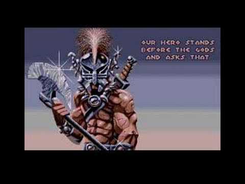
Now that was a thing I watched over and over again, and never skipped. The music is in step with the on-screen presentation.
Another intro I used to love (well, I still do):
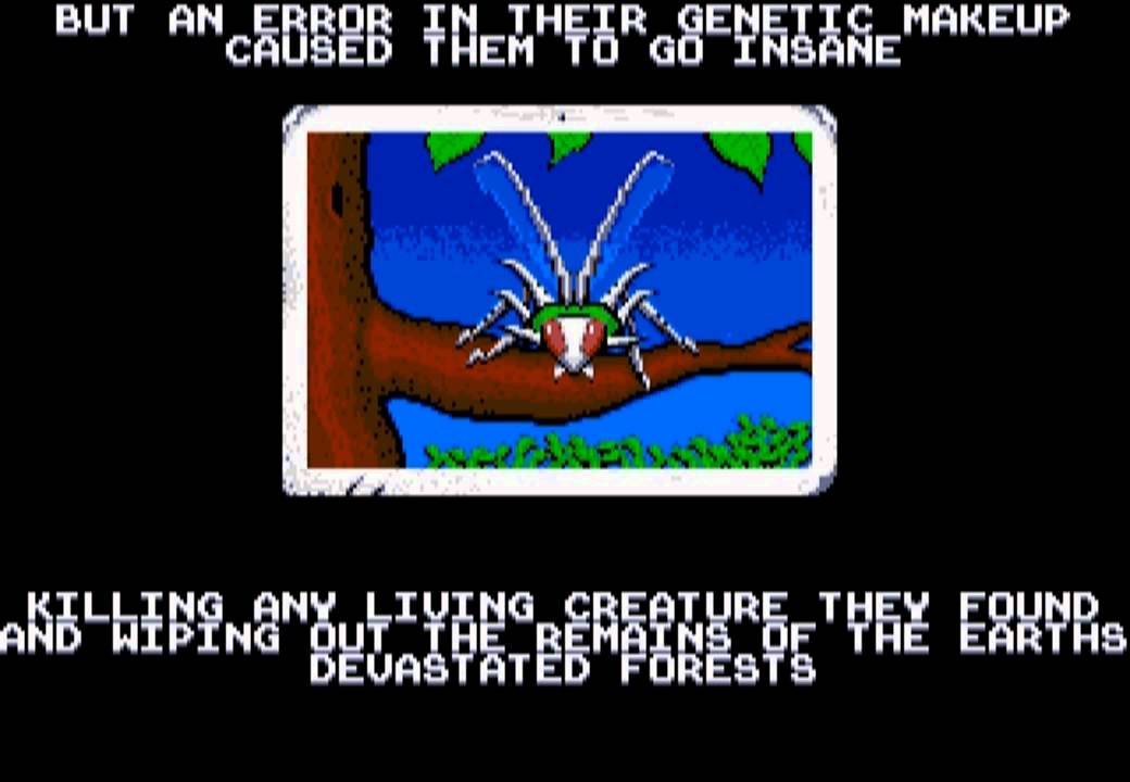
As rexbeng said, vertical jumps are too slow compared to the horizontal ones.
But hey, as a wip it’s really great.
2 Likes
And here comes part 2 of my thoughts on the game, which will cover the graphical/aesthetical segment. As most people around here know, I do understand graphics very well and have high standards, so expect the following to reflect that.
I will start with the loading/intro graphics since those come first when loading the game. So, about that Hero guy… which one of the four is it? They look entirely different, and if we focus on the helmet, there’s even one more variation in the intro. So five of those. I understand that those are all pictures found on the internet and converted (judging from other work Titan has made public, it is pretty clear that this is the case), but such inconsistencies show a lack in effort.
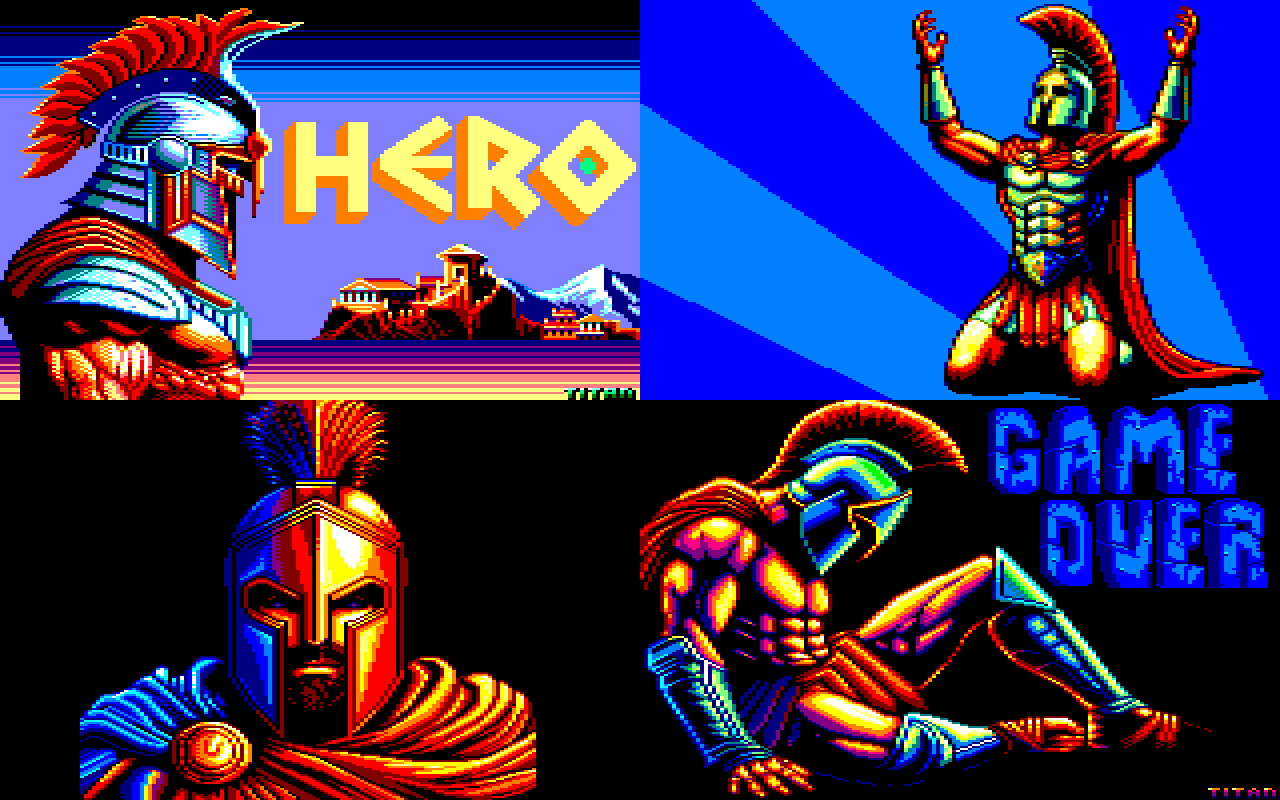
There’s a few more less obvious graphical hickups in the intro, however, the problematic one is that the text is really hard to read over those vivid blue textures. Perhaps it’s just me and my tired eyes, however a toned-down texture might work better.
Onto the in-game graphics. As I wrote in the previous comment, while not bad, they are a bit confusing. However, the biggest objection is, well, the aesthetics. If you disregard the few columns, the rest of the graphics have nothing to do with ancient Greece. Wooden barrels didn’t exist, Greeks used large pottery jars to store things. The outside walls rarely had openings, but even if you overlook that part, “windows” definitely weren’t arch-shaped and definitely didn’t have glass panes! I also saw a knight’s armor somewhere, so definitely not ancient Greek.. I’d say, those graphics depict a medieval setting instead.
Then, the enemies! Did you find Greek mythology not rich enough and opted for a baby ninja turtle, a lemming (from the game) and the snake version of Birdo (from the Mario franchise)? In fact, even the skeleton is inaccurate! We don’t have undead in Greek mythology and there were never depictions of skeletons in archaic and classical Greek art (or at least I don’t remember any, and I’ve looked at plenty). There was some of that during the later greco-roman years, but then skeleton depictions mostly had a role of jokes/cartoons; definitely not ‘evil’ or ‘dangerous’. So, the skeleton is also medieval.
And yeah, that’s all I have for you today! Hopefully you can address some of the issues as the game progresses.
2 Likes
“As most people around here know, I know a lot about graphics and I have high standards”: Big headed much? 
“I get that these are images found on the internet and then converted”: Feel free to search the web for Hero’s artwork… If you find them, I’ll buy you a beer, lol! 
Because the least you can do is check before making claims (and don’t bring up the monochrome helmet image posted earlier: that was added by Typhon, it’s not one of my creations  ).
What you need to understand is that this game doesn’t claim to be an accurate reflection of ancient Greece… It’s just a dystopian universe inspired by its history, taking all the artistic license possible.
Other than that… any positive feedback by any chance? 
1 Like
I won’t discuss the gfx subject, but that is a classical response when something is off: “it’s not an accurate depiction, it’s…”. Well, fair enough, but make it clear in the opportunity that is given to you by the intro - set the universe, explain what’s what, otherwise indeed it’s just a mishmash of different things.
1 Like
Super Mario Bros offers one of the biggest hodgepodges in video games (mushrooms, cannonballs, dinosaurs, turtles, gorillas, clouds, and so on, all cheerfully side by side), yet that doesn’t stop it from being one of the best platformers in the world.
By ‘fifth helmet variation’ I wasn’t referring to that mode 2 one Typhon had added, but to the following helmet, which was being used in the past as logo by thespritas.net.
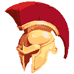
Also, as a comment on ‘mario hodgepodges’.
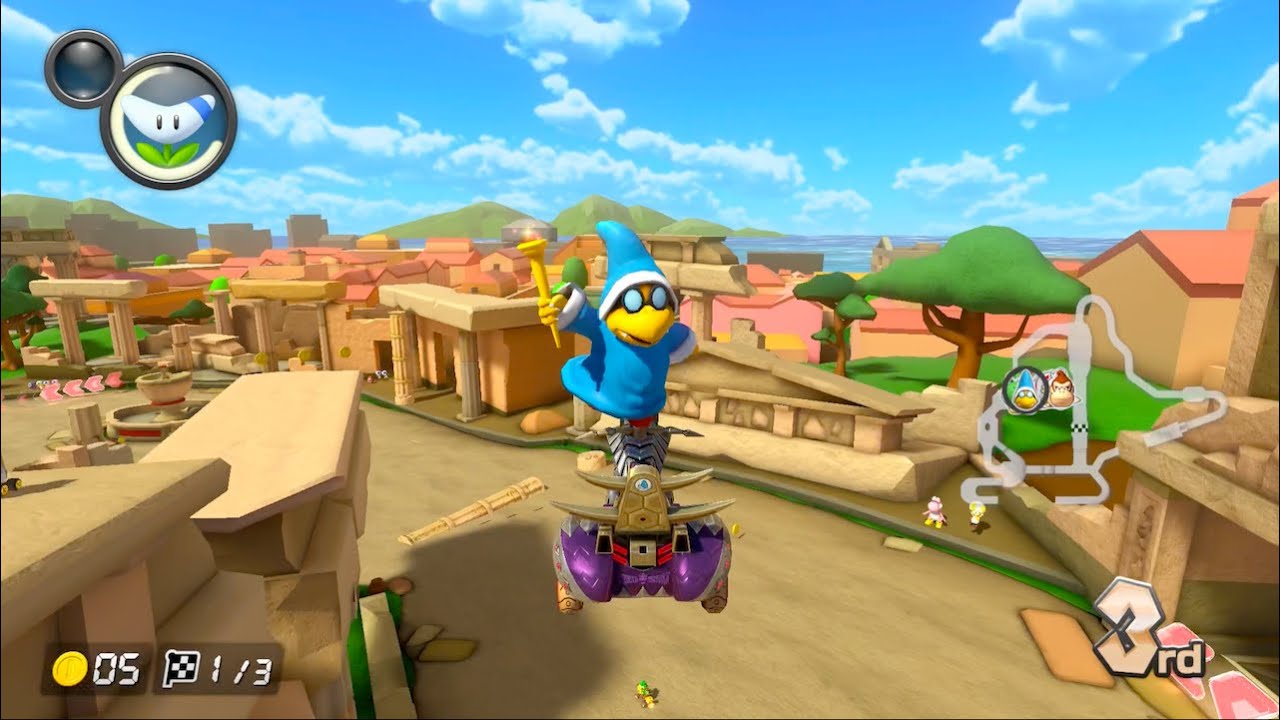
Ha, good catch!
I had indeed forgotten about that little helmet I based the intro on. Looks like I owe you a beer!
But that must be the only bit of graphic from the internet. Everything else is hours upon hours of mouse clicks in Multipaint…
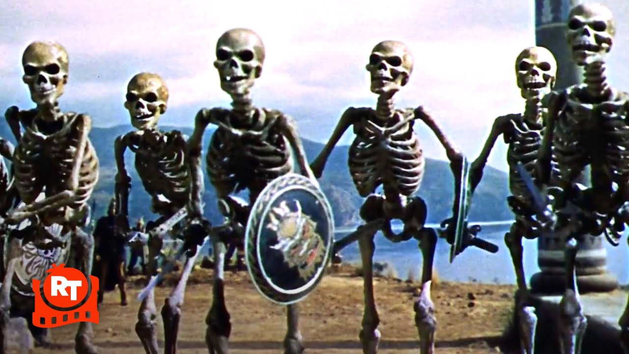
This old film is inaccurate, which shows a lack of efforts! Also, stop playing Ghosts’n’Goblins : it has zombies & carnivorous plants. Totally unacceptable !
1 Like
So you either compare to one of the best franchises ever and to crap productions from 60 years ago.
I mean… ok.
Oh I forgot! Sound is not propagated in outer space, due to the lack of air. From now on, all Shoot’em ups must be done without SFX 
1 Like
Correct, in space no one can hear you scream. 
3 Likes
Are you lot all done having an argument on my thread?
5 Likes